Revitalizing Refer.io: Crafting a Personalized Homepage Experience for Job Seekers
Client
Refer.io
Category
Web, UI/UX
Delivered
June 2020

I had a chance to do an internship with this company. One of my projects was redesigning their homepage. As far as criteria and feel, this company knew exactly what they wanted.
Refer.io strives to help jobseekers find and apply for positions that are relevant to their interests and skill sets. “The right opportunity is out there. Let’s go get it.”
The Problem
The challenge at Refer.io was to overhaul their homepage to reflect their personalized approach to job searching, making it more engaging and reflective of the company’s vibrant ethos. Despite a tight timeline during my internship, the objective was to enhance user onboarding and convey Refer.io’s commitment to connecting job seekers with tailored opportunities, ensuring the site’s first impression was both inviting and representative of their mission.
Scope & Goals
Update Website Aesthetics:
Refresh the homepage’s visual design to give it a more modern, appealing look that aligns with Refer.io’s dynamic and personable brand identity.Enhance User Onboarding:
Revamp the onboarding process to make it more engaging and enjoyable for new users, incorporating interactive elements that personalize the experience.Incorporate User Testimonials:
Integrate testimonials from active users to build trust and credibility, showcasing real success stories and positive experiences.Optimize for Mobile:
Ensure the homepage design is responsive and optimized for mobile devices, providing a seamless experience across all platforms and reflecting the company’s future vision for their email communications on mobile.

Current Site
From the photo above you can see what we were working with. It was very straightforward. If you have the luxury of meeting the founders of Refer you quickly realize this doesn’t match their personalities at all.
Constraints
The Refer.io homepage redesign was bounded by several constraints, including a tight timeline set within a brief internship period, limited daily working hours of approximately 4 hours, and the need for rapid iterations due to almost daily feedback sessions. The creative scope was further constrained by the requirement to adhere to Refer.io’s existing brand color scheme and identity. Additionally, the project had to account for the current technical capabilities and content format of Refer.io’s emails, particularly in how they would be represented on the redesigned homepage, posing unique challenges to the design process.


Variations
I played around with modular shapes because it gave a sense of depth to the phone. From there, I tried out different colors based on their current color scheme. The phone placement also happened to be something we kept going back and forth on.


Clay Phone Mockup
When we started throwing around ideas for the homepage. I realized we didn’t have a ‘giveaway’ to what Refer was. If someone stumbles upon the site it should be easy to know what they do. From there we talked about showing the idea in action somehow.
We settled on the idea of using a mock phone. This wasn’t to show off an app but rather what they eventually wanted their emails to look like on mobile. Right now, the emails are not as clean but the content is more or less the same.

Final Design


Key Takeaways
We were able to accomplish the ‘personal’ touch by having the subscribe process be a series of laid-back questions. Although this adds a few more ‘clicks’ than their original it also worked to make the application more fun. As you answered a question the phone on the right updated with you.
Responsive Design
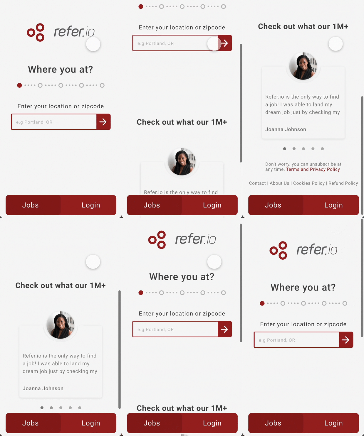
We did create a design that would adapt well on mobile as well. We kept all the same elements but moved a button to be fixed to the bottom. This made it front and center while still maintaining the playful aspects that were offered on the desktop. It made sense to strip out the mock phone because most of their mobile users are current users, not first-time visitors.
Results & Conclusion
The makeover of Refer.io’s homepage really hit the mark, bringing a whole new level of personal touch and engagement to the user experience. We managed to pull this off despite the crunch for time and just a few hours to work each day. It was all about quick, smart tweaks based on heaps of feedback. Looking back, it was a crash course in staying nimble, chatting clearly, and always keeping the user in mind. It just goes to show, even when the clock’s ticking and resources are tight, you can still make something pretty awesome if you keep your focus on what matters most – the people using your design.


